

Valentines Tablescapes
- Feb 15
- 2 min read
Updated: Feb 16

Valentine’s Day has a funny way of splitting the world into two camps: the unapologetic romantics who want red, roses, and a small avalanche of hearts… and the quiet aesthetes who prefer softness, light, and something that feels like spring whispering through the windows. This year, I refused to choose. So I set the table twice.
Classic Valentine: Love Letters & Lipstick Kisses


The first table leans fully into the drama — in the best possible way. Think old-fashioned valentines, handwritten notes, lipstick marks on envelopes, and the kind of romance that is just a little theatrical.
Layers were everything here. A red heart doily added instant texture and a touch of nostalgia, like something rescued from a childhood craft box but elevated into something intentional. On top of that, I folded a pink-and-white striped napkin into a heart shape — a small detail that quietly steals the show once guests sit down.
The glassware was playful and completely unserious in the way Valentine’s Day should be. Kiss-print cups paired with pink wine glasses trimmed in pearl details felt equal parts sweet and cheeky, like the table itself was flirting with you. I tucked in love letters as part of the styling, because nothing says romance quite like paper that might contain either poetry or inside jokes.
And yes — I decorated the chandelier.
It walked the fine line between “have I lost my mind?” and “why does this actually work?” Suspended hearts overhead made the whole room feel immersed, not just the tabletop. Sometimes the difference between over-the-top and magical is simply committing all the way.
Garden Party Valentine: Pink Gingham & Soft Sunshine


The second table is what Valentine’s Day might look like if it woke up early, opened the windows, and decided to be cheerful instead of moody.
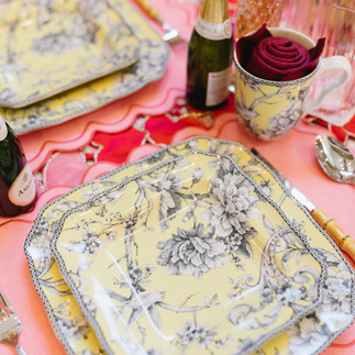
A pink-and-white gingham tablecloth set the tone immediately — casual, nostalgic, and quietly joyful. On top of it, scalloped placemats in a soft peachy pink added shape and softness, while yellow bird floral dishes introduced an unexpected brightness. Pink and yellow together feel like sunlight on cotton candy — sweet, but not saccharine.
Bamboo flatware grounded the look with a natural texture, preventing the palette from floating away into pure confection. Then came the details that make a place setting feel personal: a mini bottle of champagne waiting like a tiny celebration, peach-toned flutes catching the light, and a napkin rolled into a rose and tucked into a mug as if it had just bloomed there.
This table feels less like a formal Valentine’s dinner and more like a long brunch with people you love — the kind where no one checks the time and the coffee keeps getting refilled.


Comments